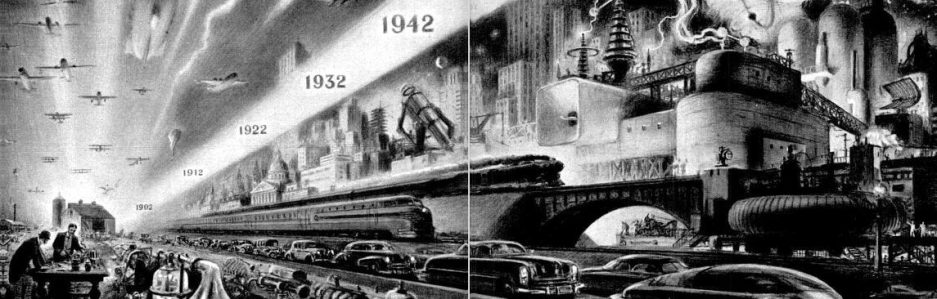
Digitization has enabled the accumulation, storage, and manipulation of enormous amounts of data. The numbers involved are mind boggling and we’re becoming familiar with ever larger orders of magnitude (remember when a gigabyte was a big deal?). And we’ve been hearing similar claims long enough now that we hardly notice when someone like Google CEO Eric Schmidt tells us that every two days we create as much information as we did from the beginnings of civilization until 2003. And, of course, we are told that the pace will only quicken and we will keep achieving ever larger orders of magnitude in data production.
So the question seems to be, what do we do with all of this data? A good deal of it is of little or no value, and so filtering through it presents a significant challenge. Representing data meaningfully can also be a challenge and here visualization can be quite helpful. A couple of recent instances of visualized data come to mind. The first is Google Lab’s Books Ngram Viewer. The Ngram Viewer allows a user to search a database of digitized books published from 1500 to the present for particular words or phrases. The Viewer then generates a graph plotting the frequency with which the words or phrases have been used during a particular time period. So for example, here is a graph tracking the occurrences in English books written between 1700 and 2010 of the names of three philosophers — Rene Descartes, John Locke, and Thomas Hobbes:

One of the limitations of the approach comes to mind when you can’t be sure if a movement in the mentions of “John Locke” is owed to greater interest in modern political philosophy or a certain television character (or, more interestingly, both together).
Here is another graph, this one plotting the use of the words nostalgia and Nostalgia (the search is case sensitive) just because I’m intrigued by the idea:

Another recent and more elegant instance of visualized data comes from Facebook. The graphic below was generated by potting lines representing a sampling of FB friendships. What is most fascinating about this graphic is that no independent lines representing the continents were included, all shapes emerged from the data:

So we have two instances of data rendered intelligible, at least let us say manageable or usable. But there is still another question, what does it mean? How do we interpret the data. The charts and image above represent a tremendous amount of data, but what do we make of it? That still requires judgment, context, and a story. This is more or less the point Katherine Hayles makes in her response to Ed Folsom’s “Database as Genre: The Epic Transformation of Archives.” Here are some comments I’ve taken from Hayles’ essay which apply rather well to both cases, especially to Google’s Ngram Viewer (keep in mind her responses are to Ed Folsom who maintains the Walt Whitman Archive online):
What it means that Whitman, say, used a certain word 298 times in Leaves of Grass while using another word only three times requires interpretation—and interpretation, almost inevitably, invokes narrative to achieve dramatic impact and significance …
These structures imply that the primary purpose of narrative is to search for meaning, making narrative an essential technology for human beings, who can arguably be defined as meaning-seeking animals …
Manovich touches on this contrast when he perceptively observes that for narrative, the syntagmatic order of linear unfolding is actually present on the page, while the paradigmatic possibilities of alternative word choices are only virtually present. For databases, the reverse is true: the paradigmatic possibilities are actually present in the columns and the rows, while the syntagmatic progress of choices concatenated into linear sequences by SQL commands is only virtually present …
No longer singular, narratives remain the necessary others to database’s ontology, the perspectives that invest the formal logic of database operations with human meanings and that gesture toward the unknown hovering beyond the brink of what can be classified and enumerated.
In other words, data seeks a story because humans seek a story — it’s our primordial way of navigating the increasingly dense forest of data. It is also worth bearing in mind Jerome McGann’s observations regarding databases (also in response to Folsom):
No database can function without a user interface, and in the case of cultural materials the interface is an especially crucial element of these kinds of digital instruments. Interface embeds, implicitly and explicitly, many kinds of hierarchical and narrativized organizations. Indeed, the database—any database—represents an initial critical analysis of the content materials, and while its structure is not narrativized, it is severely constrained and organized. The free play offered to the user of such environments is at least as much a function of interface design as it is of its data structure—whether that structure be a database structure or, as in the case of The Walt Whitman Archive, a markup structure . . .
Bottom line: The interface is not neutral and for that matter neither is the data because it has already been tagged and marked up in certain way when the database architecture was designed and the information entered in accordingly.
If databases and interfaces that give us access to the immense amount of information being digitized are going to be useful to us, we need to make sure we understand the embedded limitations so that these limitations do not become immense blind spots for us as we try to do what we must always do with information — make a story out of it. And the making of the story, a basic human drive, requires an awareness of context, judgment and discernment, and a certain wisdom that, as of yet, the database and clever, even elegant, means of representing the data stored in them, are not by themselves going to bring to the task. It may be worth remembering the old adage, information is not knowledge and knowledge is not wisdom.


